jackxalan/blog/
AN IDENTITY FOR ANAHEIM
Jack Cummings • 01.21.24
Vexillology, or the study of flag design, seems to have taken the internet by storm over the last decade, and has become a serious hobbyist interest. In every corner of the US, it seems like we’ve heard of a recent flag redesign. From Mississippi to Utah to Minnesota, states are leaving behind some dated, problematic icons of the past to embrace this new wave of interest in design.
This “new wave” of flag design is primarily based upon guidelines identified by the North American Vexillological Association publication Good Flag, Bad Flag. The “Five Principles” outlined in that publication are:
- Keep It Simple
- Use Meaningful Symbolism
- Use 2 or 3 Basic Colors
- No Lettering or Seals
- Be Destinctive or Be Related
While these rules do tend to mesh with iconic flag designs, the contemporary flags being designed to fit exclusively within these principles have more recently been receiving critiques of their own.
A few years back, the city of Anaheim, California was hoping to do the same. At the time, they had what some considered to possibly be the worst flag design ever.
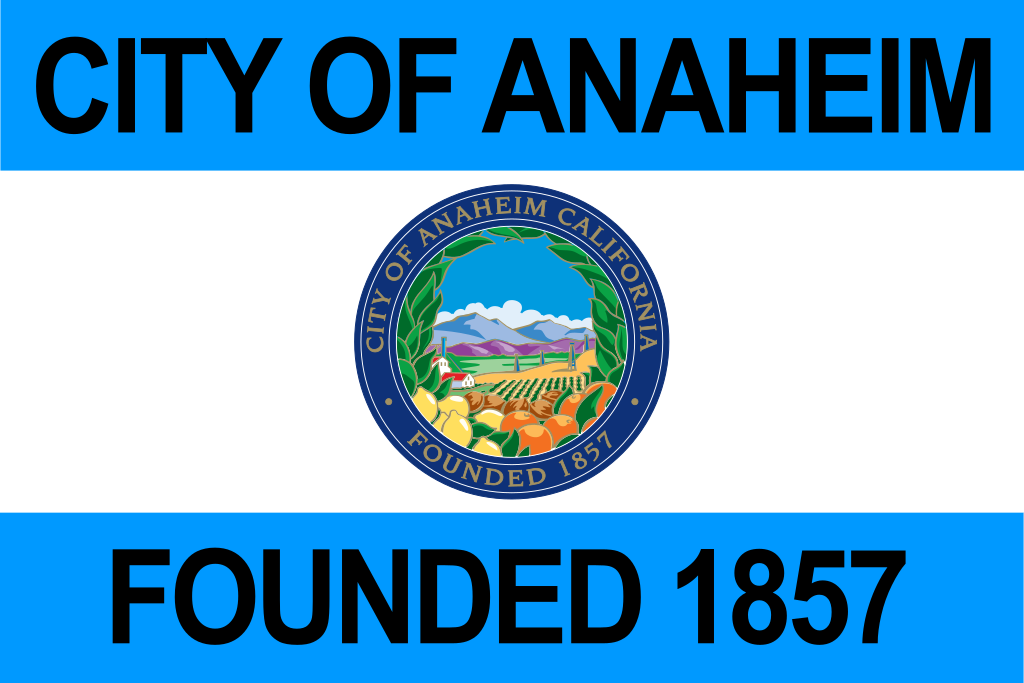
The original designer, Howard “Bud” Nagel, was the Public Information Officer for Anaheim in the 60s. As such, artistry and thoughtful composition didn’t seem to be a priority.
In 2018, the city sought designs from artists to re-think its flag; I threw my hat in!
At the time, I had been living in Anaheim for 4–5 years; it had really become my home-away-from home. Outside of Disneyland, I truly loved spending time downtown on Center St. Promenade, which had been drastically reimagined in the five years prior. Local business had taken over, with everything from a comic book store (RIP Pop!) to a traditional Japanese bakery.git-
The real draw for non-locals, though, was the Anaheim Packing District, one of the earliest food halls to become successful in SoCal. It opened in 2014 in the shell of the former Sunkist citrus packing house, a reminder that before fairy tales and mice arrived in Anaheim, citrus farming defined the region. Stories of the orange groves are plentiful in discussions of Disneyland’s past; and while it may not be the seat of Orange County, Anaheim is probably the most well-known metropolis for anyone not familiar.
This line of thinking, then, brought me to an obvious conclusion and design inspiration. For my design, I used a similar “silhouette”, if you will, to the old design - two bars above and below a central image. For the image itself, I tried to play with the concept of an orange that would read as an orange while still fitting within the principles outlined above. (Admittedly, I was enamored with those five principles then, an attitude I don’t necessarily still keep.)
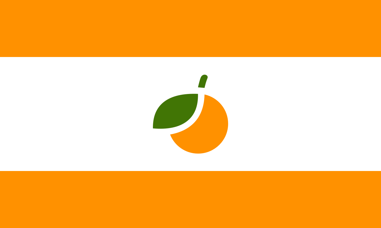
While there would be things I would do differently today (retain more detail in the orange like Mississippi’s flower opposed to attempting a Canada-esque silhouette), I still really enjoy this design! It’s one of my favorite pieces of design-work over the years, and perhaps my favorite flag I’ve done.
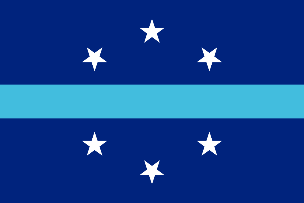
Ultimately, though, I wouldn’t be chosen. The winning design is more reminiscent of flags like Washington, D.C.’s or Chicago’s - too much, in my opinion.
I wish there was a bit more spirit in the design, and perhaps city officials thought so too, as Anaheim chose to revert back to its original in 2019. For all that effort, the “new” flag lasted less than a year. 💀